OrbytaLabs



Clear Pay
A clean payment experience for everyday transfers
Context & Problem Space
ClearPay is a finance SaaS dashboard designed for freelancers and SMEs in emerging markets who regularly receive international payments. It makes hidden transfer fees, platform charges, and FX conversion losses visible, then recommends clearer provider choices so users can save money and plan better.
Veda enters the scene to fill this gap—bringing a friendly, modern, and secure financial solution to users who want simplicity without compromising trust.

The Product
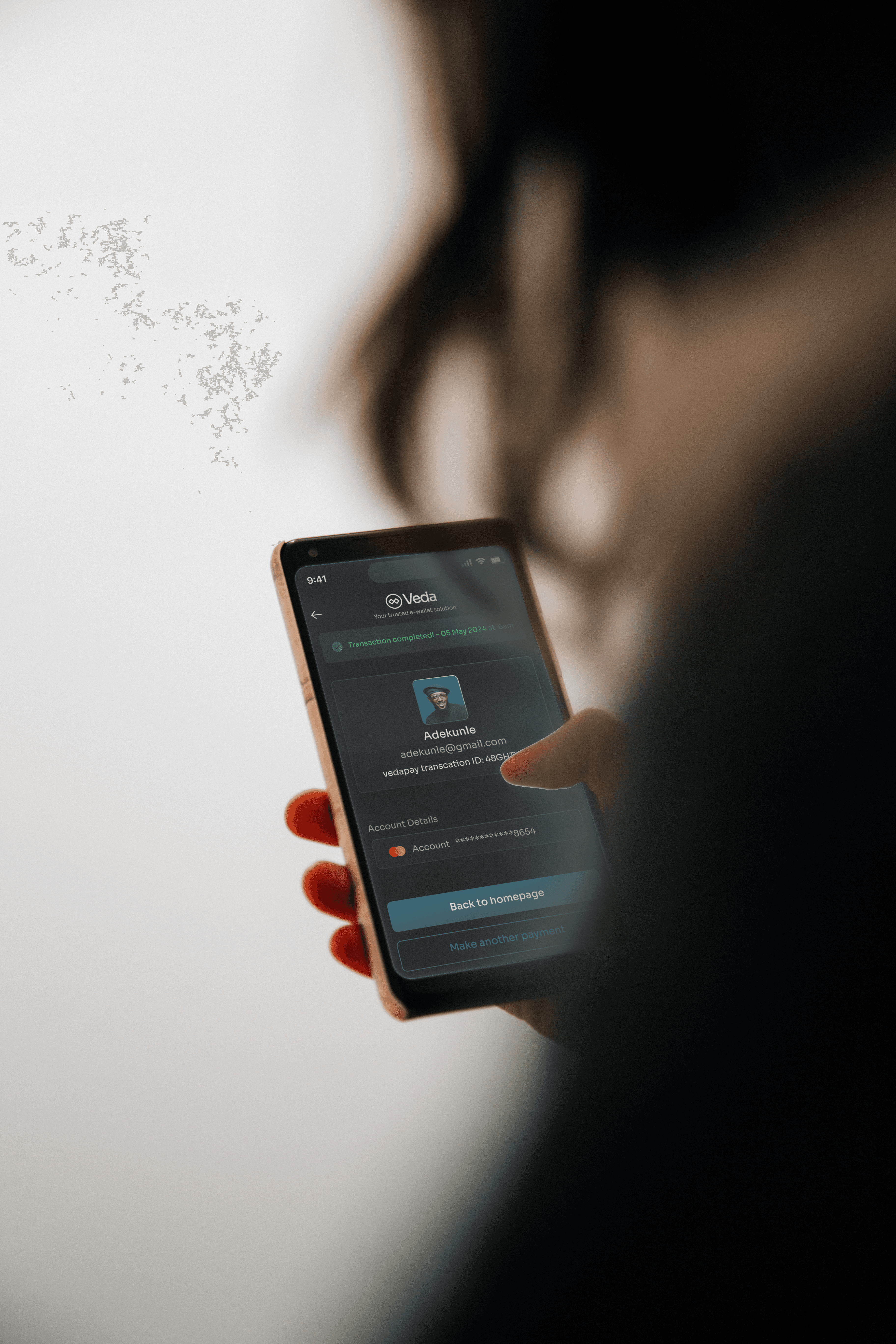
VEDA is a mobile-first E-wallet app that empowers users across Africa to manage money securely, swiftly, and conveniently. The app combines banking essentials, smart budgeting, and seamless transactions, all within an intuitive interface built for diverse tech users.
We take security seriously and use the latest encryption technologies to keep your 600
financial information protected. With biometric authentication, you can trust that your funds are always safe with Zond.
The Problem
Inconsistent financial platforms and a lack of intuitive design in mobile banking apps make it difficult for users to manage their money efficiently. Users often juggle multiple apps, face hidden charges, and struggle with understanding how to navigate complex interfaces.
Moreover, users are concerned about the security of their financial information, especially when using mobile apps for financial transactions. The rise of cybercrime has made it crucial for users to have confidence in the security measures of the app they use.

Solutions to the Problem Statement for Veda
Veda E-Wallet is designed to provide users with a convenient, secure, and seamless way to manage their finances.
We understand that managing finances can be a hassle, with users feeling disconnected and concerned about security when using mobile apps for financial transactions.
That's why we created VedaPay E-Wallet, to simplify and secure your finances with ease.

PROTOTYPE
Project Timeline
Duration: 4 weeks Team: Solo Designer (UI/UX) + Feedback from mentors

Target Users
First-time users of fintech apps (age 18-35)
Freelancers, remote workers, small business owners
Urban youth with smartphones and inconsistent banking experiences

Research Methods
User Interviews (8 participants)
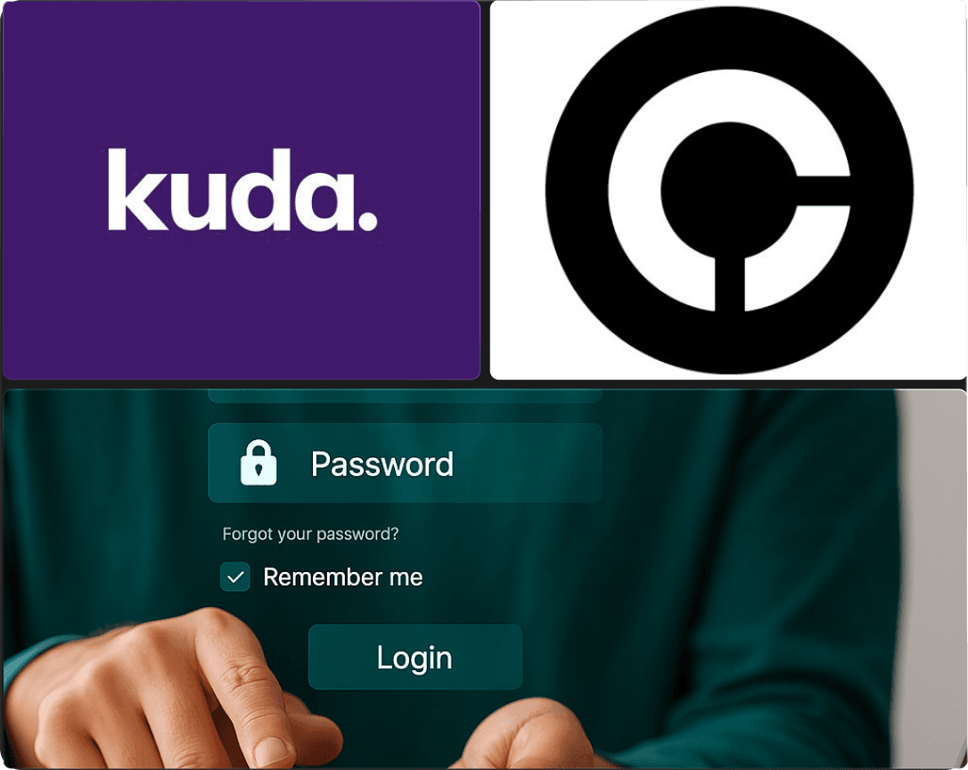
Competitor Analysis: Kuda, Opay, Chipper Cash
Survey (45 responses) via Google Forms
The Goal
To design a modern, accessible, and trustworthy E-wallet application that simplifies the way individuals and small businesses manage their money. The app should support:
Easy onboarding for low-tech users
Lightning-fast transfers and bill payments
Transparent fees and budgeting features
Secure authentication and data handling

Empathy Map
Empathy mapping helps us understand our users' needs and emotions to create a seamless and user-friendly charging experience. By considering what catches their attention, evokes emotions, and influences their decisions, we can design an intuitive and efficient platform that meets their expectations.

User Persona
To better understand potential users , I interviewed 5 individuals. These interviews aimed to gather insights on their experiences with existing Fintech apps and E-wallet apps, identify pain points, and gather suggestions for improvement. It became clear that smartphone users are the primary target audience for the app.


User Flow

Visual Design
Empathy mapping helps us understand our users' needs and emotions to create a seamless and user-friendly charging experience. By considering what catches their attention, evokes emotions, and influences their decisions, we can design an intuitive and efficient platform that meets their expectations.


Ideation & Wireframes
Initial sketches focused on simplifying onboarding and guiding first-time users. Key wireframe flows:
Splash → Onboarding Carousel → Signup/Login
Wallet Overview → Actions Menu → Fund Transfer/Pay Bills


High-Fidelity Mockups
Based on the insights from the usability studies, I applied the design changes, including a clear navigation system and search and a more straightforward flow.
Below we will take a look at the most important application screens separately.


High-Fidelity Mockups
Based on the insights from the usability studies, I applied the design changes, including a clear navigation system and search and a more straightforward flow.
Below we will take a look at the most important application screens separately.


Usability Testing Highlights
To design a modern, accessible, and trustworthy E-wallet application that simplifies the way individuals and small businesses manage their money. The app should support:
Onboarding time reduced: 4.2min ➔ 2.1min average
Feedback: Older users struggled with the onboarding flow.
Fix: Added clearer CTA buttons and support tooltip.
Result: 3x higher success rate among first-time users post-change.


Reflection
Designing VEDA taught me the value of accessible design for all users, especially in fintech. Balancing simplicity with functionality was key. A modular UI system allowed for scalability and clear navigation paths.
Designing with transparency in mind led to deliberate UI decisions that kept users informed and in control. My biggest challenge was ensuring the app felt both futuristic and familiar.

Next steps
Add dark mode and voice accessibility
Integrate budgeting tools and savings vaults
Expand to crypto wallet support
ROLE
UX & UI
Product Strategy
Branding
Website Development
PROTOTYPE
TEAM



DURATION AND DATE
2024
September 2025 – October 2025